185+ Principles to Validate Any Design
185 principles organized by topic and difficulty. Each one includes citations, product examples, and AI prompts ready to paste into Cursor, V0, or Claude.
Good design is not based on instinct. It is based on how people actually process information: what they notice, what they ignore, and why they leave.
These 185 principles cover the patterns behind those decisions. Browse by part, filter by difficulty, or search for a specific problem. Each one links to the research and includes AI prompts you can paste straight into your tool of choice.
Showing 1–12 of 22 principles

Free
Progressive Disclosure
Reveal complexity in stages so users aren't overwhelmed. Progressive disclosure cuts time to first action 30-50% while keeping 70-90% feature discovery.
Fixes:OverloadedForm Graveyard
Explore principle
Premium
Visual Hierarchy Law
Visual hierarchy (Tufte 1983, Nielsen 2006) demonstrates systematic variation in size, weight, color, and position improves information processing 40-60% and comprehension 25-35% through F-pattern optimization and Gestalt perceptual organization.
Fixes:OverloadedLow Contrast
Explore principle
Premium
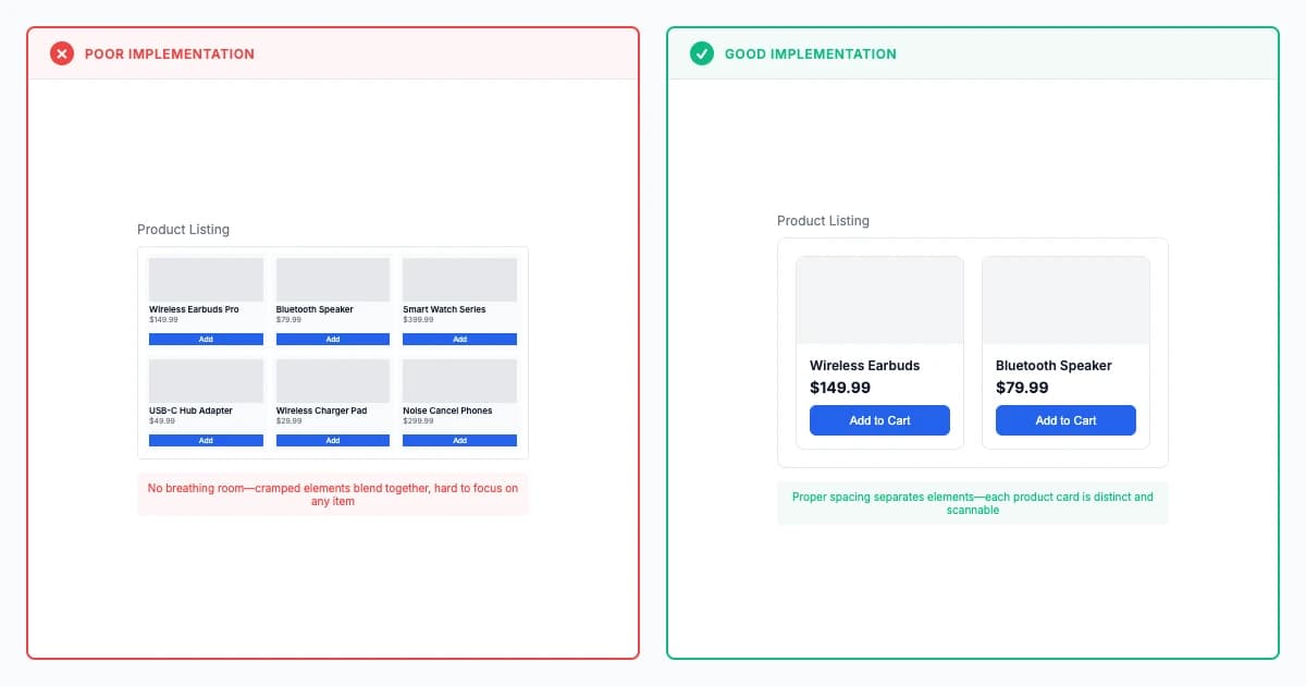
White Space Usage Law
White space usage (Bringhurst 1992) improves readability 20-40% and comprehension 15-25% through strategic spacing, with 120-145% line height and 50-75 character measure reducing eye strain 50-70% via Gestalt proximity principles.
Fixes:Overloaded
Explore principle
Get Full Access
185 research-backed principles
$29/year
- All principles with citations
- AI prompts for every principle
- Real-world examples
30-day money-back guarantee
Premium
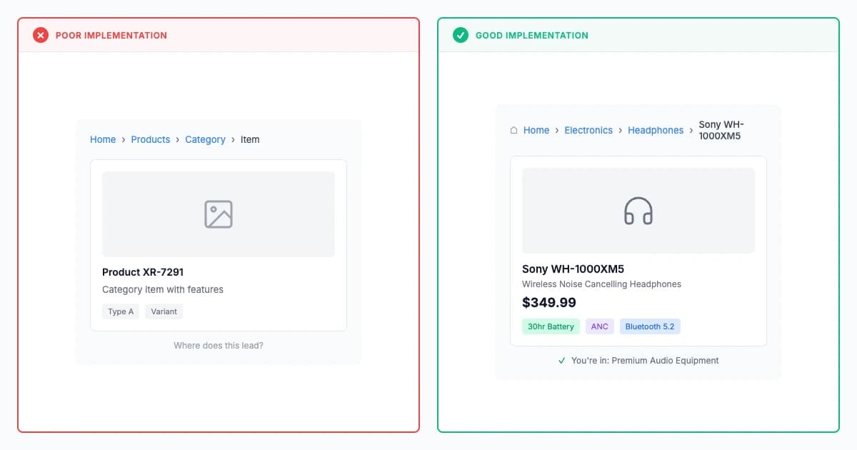
Information Scent Law
Users follow scent through labels, links, and headings. Strong information scent cuts navigation time 30-50% and failed clicks up to 60%.
Fixes:Mystery Nav
Explore principle
Premium
Content Hierarchy Law
Content hierarchy law (Wertheimer 1923, Nielsen 2006) demonstrates F-pattern optimization and visual prominence improves information processing 40-60% and comprehension 25-35% through systematic importance signaling and scannable layouts.
Explore principle
Premium
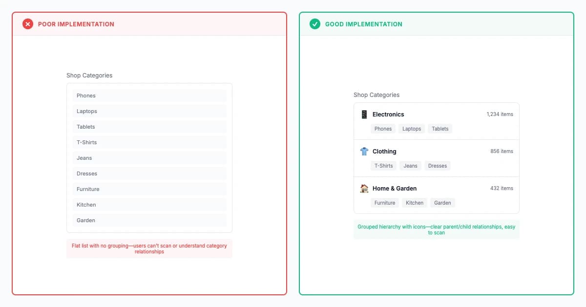
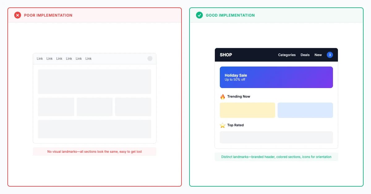
Landmark Navigation Law
Landmark navigation (Lynch 1960, von Restorff 1933) demonstrates distinctive reference points reduce disorientation 40-60% and improve wayfinding efficiency 30-50% through visible, memorable, and meaningful visual elements at decision points.
Fixes:Mystery Nav
Explore principle
Premium
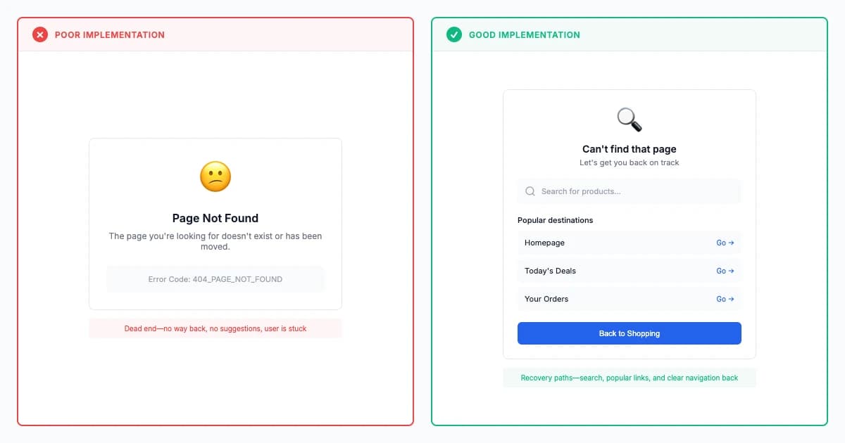
Navigation Recovery Law
Navigation recovery (Norman 1988, Nielsen 1994) provides multi-modal safety nets (persistent home, global search, breadcrumbs) achieving 50-70% faster lost-state recovery and 35-45% reduced abandonment through comprehensive escape routes.
Fixes:Dead Ends
Explore principle
Premium
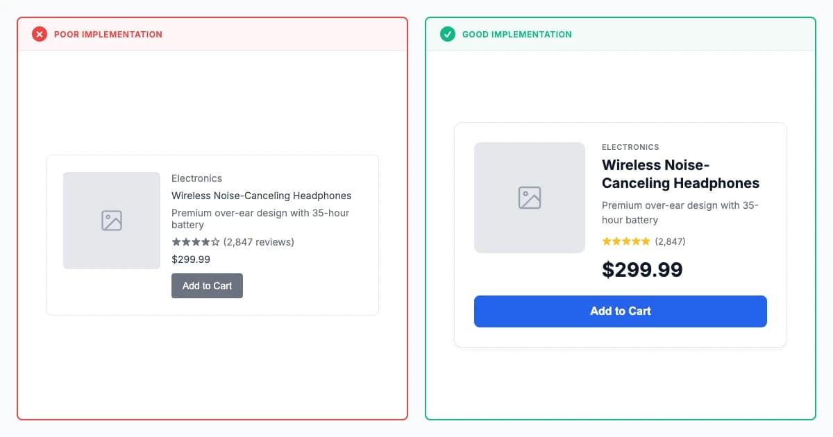
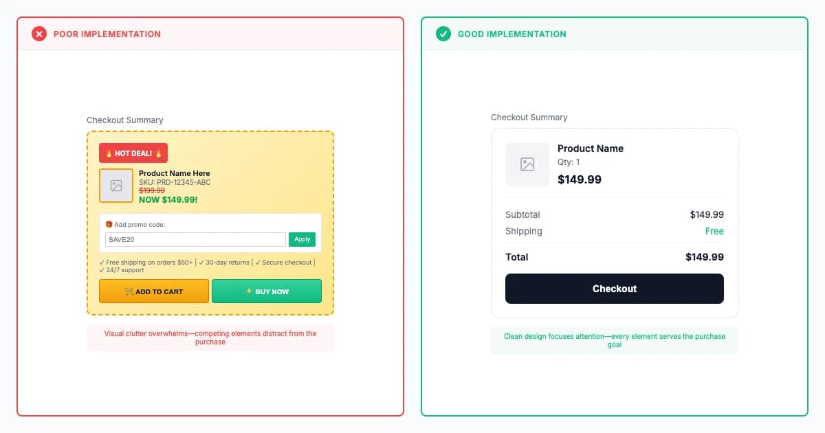
Aesthetic and Minimalist Design
Aesthetic minimalism (Nielsen 1994, Reber 2004) demonstrates eliminating extraneous elements improves task completion 25-40% and reduces errors 20-30% while processing fluency creates 40-60% higher perceived usability through visual clarity.
Fixes:Overloaded
Explore principle
Premium
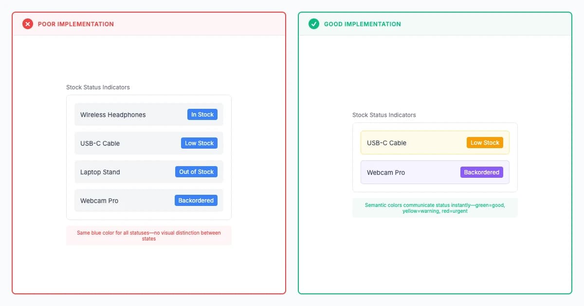
Color Psychology Law
Color psychology leverages semantic associations (green success, red danger, blue trust) improving element findability 25-40% and reducing errors 30-50%, requiring 4.5:1 contrast and cultural adaptation for global markets.
Fixes:Low Contrast
Explore principle
Premium
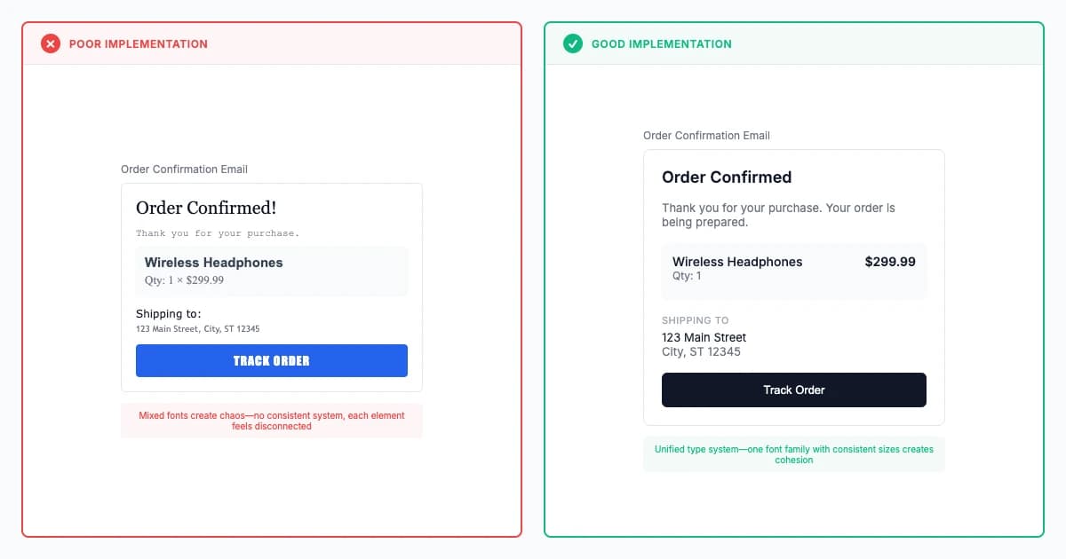
Typography System Law
Typography systems (Bringhurst 1992) built on modular type scales and mathematical ratios improve reading comprehension 30-50% and reduce cognitive load 25-40% through systematic hierarchies and optimized performance across platforms.
Fixes:Inconsistent
Explore principle
Premium
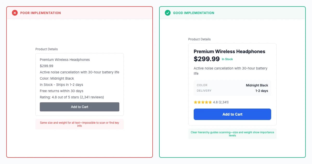
Typography Hierarchy Law
Typography hierarchy (Arnheim 1954) using size, weight, spacing, and color variations improves skimmability 40-60%, reduces time-to-content 30-50%, and increases comprehension 20-30% through multi-dimensional redundant encoding.
Fixes:OverloadedLow Contrast
Explore principle
Premium
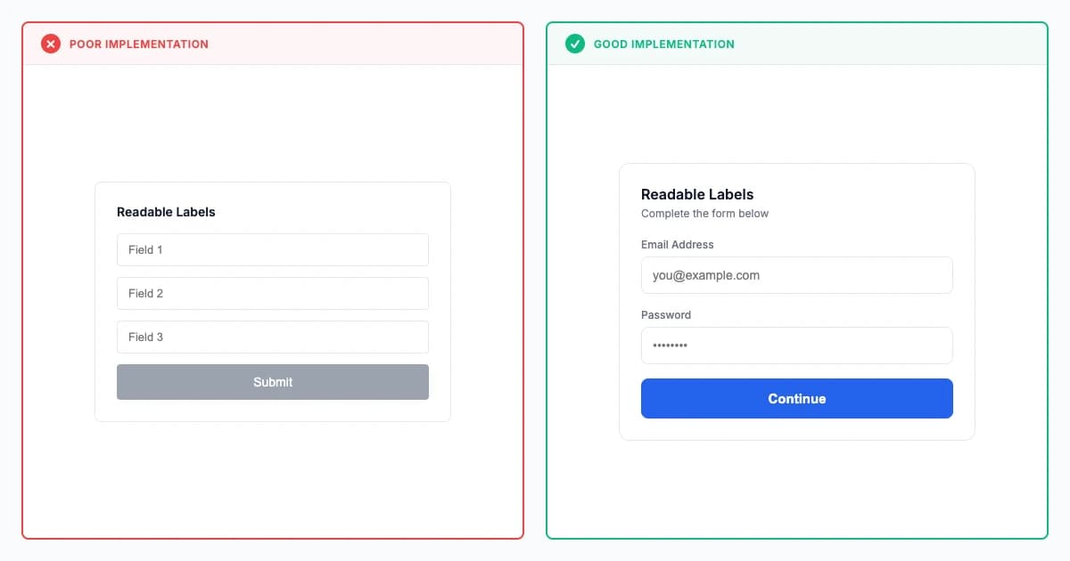
Typography Accessibility Law
Typography accessibility (WCAG 2.2) requires 4.5:1 contrast, scalable sizing, and semantic markup improving readability for low-vision users 60-80% while lifting general reading speed 10-15% and reducing eye strain 20-30% universally.
Explore principle